Step3. Draw Graph
注釈
流体の指定方法および PinchAnalyzer の説明をまた読んでいない方は、 まずはStep1. Create Stream および Step2. Analysis を読んでください。
PinchAnalyzer を用いた解析によって、グラフを描画するための情報を得ることができます。以下の create_* を呼ぶことで得ることができます。
create_grand_composite_curve: グランドコンポジットカーブcreate_tq: TQ線図create_tq_separated: 流体ごとに分割したTQ線図create_tq_split: 流体ごとに分割し、最初接近温度差を満たすように分割したTQ線図create_tq_merged: 結合可能な熱交換器を結合したTQ線図
例で用いる analyzer は以下のコードによって作成されたと仮定しています。
from pyheatintegration import PinchAnalyzer, Stream

streams = [
    Stream(40.0, 90.0, 150.0),
    Stream(80.0, 110.0, 180.0),
    Stream(125.0, 80.0, 180.0),
    Stream(100.0, 60.0, 160.0)
]

minimum_approach_temperature_difference = 10.0
analyzer = PinchAnalyzer(streams, minimum_approach_temperature_difference)
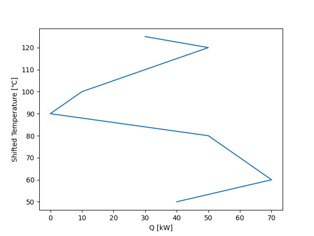
グランドコンポジットカーブ
analyzer.create_grand_composite_curve() を用いて、熱量と温度のリストを取得することができます。
heats, temps = analyzer.create_grand_composite_curve()
fig, ax = plt.subplots(1, 1)
ax.set_xlabel("Q [kW]")
ax.set_ylabel("Shifted Temperature [℃]")
ax.plot(heats, temps)
fig.savefig("path/to/grand_composite_curve.png")
TQ線図
PinchAnalyzer は以下の4種類のTQ線図を描くためのデータを提供します。
create_tq() create_tq_separated() create_tq_split() create_tq_merged()
は、プロットに必要な直線を以下のような形式で返します。
# [((始点の座標), (終点の座標)), ((始点の座標), (終点の座標)), ...]
lines = [((0, 0), (1, 1)), ((1, 2), (2, 3))]
タプルの第一成分が直線の始点の座標、第二成分が終点の座標を表します。また、与熱複合線と受熱複合線をタプルで返します。それぞれを matplotlib.collections.LineCollection に変換後、ax.add_collection を行うことで直線をプロットすることができます。
# 複合線を表示
fig, ax = plt.subplots()
hot_lines, cold_lines = analyzer.create_tq()
ax.add_collection(LineCollection(hot_lines))
ax.add_collection(LineCollection(cold_lines))
さらに、複合線において、直線が折れ曲がっている点を通る熱量の線をプロットしたい場合、 y_rangeと extract_x を呼ぶことで、必要な情報を得ることができます。
# たて線を表示
ymin, ymax = y_range(hot_lines + cold_lines)
heats = extract_x(hot_lines + cold_lines)
ax.vlines(heats, ymin=ymin, ymax=ymax, linestyles=':', colors='k')
- extract_x(lines: list[Line]) list[float]
例
>>> extract_x([
        ((0, 0), (1, 1)),
        ((1, 1), (2, 2)),
        ((2, 2), (3, 5)),
        ((3, 3), (5, 8))
    ])
>>> [0, 1, 2, 3, 5]
- y_range(hot_lines: list[Line], cold_lines: list[Line]) tuple[float, float]
例
>>> y_range([
        ((0, 0), (1, 1)),
        ((1, 1), (2, 2)),
        ((2, 2), (3, 5)),
        ((3, 3), (5, 8))
    ])
>>> (0, 8)
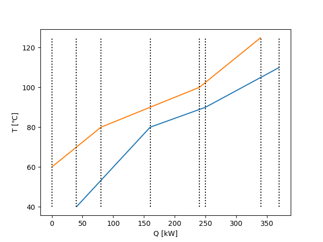
通常のTQ線図
hot_lines, cold_lines = analyzer.create_tq()
# 与熱複合線と受熱複合線
fig, ax = plt.subplots(1, 1)
ax.set_xlabel("Q [kW]")
ax.set_ylabel("T [℃]")
ax.add_collection(LineCollection(hot_lines, colors="#ff7f0e"))
ax.add_collection(LineCollection(cold_lines, colors="#1f77b4"))
ax.autoscale()
fig.savefig("path/to/tq_diagram.png")
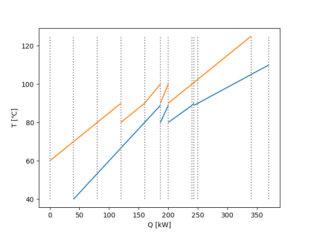
# 熱量の区間ごとのたて線も表示
ymin, ymax = y_range(hot_lines + cold_lines)
heats = extract_x(hot_lines + cold_lines)
fig, ax = plt.subplots(1, 1)
ax.set_xlabel("Q [kW]")
ax.set_ylabel("T [℃]")
ax.add_collection(LineCollection(hot_lines, colors="#ff7f0e"))
ax.add_collection(LineCollection(cold_lines, colors="#1f77b4"))
ax.vlines(heats, ymin=ymin, ymax=ymax, linestyles=':', colors='k')
ax.autoscale()
fig.savefig("path/to/tq_diagram_with_vlines.png")

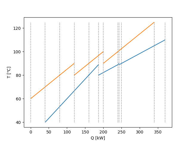
流体ごとに分割したTQ線図
hot_lines_separated, cold_lines_separated = analyzer.create_tq_separated()

# 与熱複合線と受熱複合線
fig, ax = plt.subplots(1, 1)
ax.set_xlabel("Q [kW]")
ax.set_ylabel("T [℃]")
ax.add_collection(LineCollection(hot_lines_separated, colors="#ff7f0e"))
ax.add_collection(LineCollection(cold_lines_separated, colors="#1f77b4"))
ax.autoscale()
fig.savefig("path/to/tq_diagram_separated.png")

# 熱量の区間ごとのたて線も表示
ymin, ymax = y_range(hot_lines_separated + cold_lines_separated)
heats_separated = extract_x(hot_lines_separated + cold_lines_separated)
fig, ax = plt.subplots(1, 1)
ax.set_xlabel("Q [kW]")
ax.set_ylabel("T [℃]")
ax.add_collection(LineCollection(hot_lines_separated, colors="#ff7f0e"))
ax.add_collection(LineCollection(cold_lines_separated, colors="#1f77b4"))
ax.vlines(heats_separated, ymin=ymin, ymax=ymax, linestyles=':', colors='gray')
ax.autoscale()
fig.savefig("path/to/tq_diagram_separated_with_vlines.png")

最小接近温度差を満たすように流体を分割したTQ線図
hot_lines_split, cold_lines_split = analyzer.create_tq_split()

# 与熱複合線と受熱複合線
fig, ax = plt.subplots(1, 1)
ax.set_xlabel("Q [kW]")
ax.set_ylabel("T [℃]")
ax.add_collection(LineCollection(hot_lines_split, colors="#ff7f0e"))
ax.add_collection(LineCollection(cold_lines_split, colors="#1f77b4"))
ax.autoscale()
fig.savefig("path/to/tq_diagram_split.png")

# 熱量の区間ごとのたて線も表示
ymin, ymax = y_range(hot_lines_split + cold_lines_split)
heats_split = extract_x(hot_lines_separated + cold_lines_separated)
fig, ax = plt.subplots(1, 1)
ax.set_xlabel("Q [kW]")
ax.set_ylabel("T [℃]")
ax.add_collection(LineCollection(hot_lines_split, colors="#ff7f0e"))
ax.add_collection(LineCollection(cold_lines_split, colors="#1f77b4"))
ax.vlines(heats_split, ymin=ymin, ymax=ymax, linestyles=':', colors='gray')
ax.autoscale()
fig.savefig("path/to/tq_diagram_split_with_vlines.png")
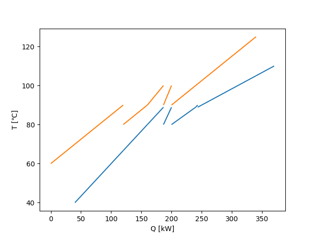
分割後の流体のうち、結合可能な熱交換器を結合したTQ線図
hot_lines_merged, cold_lines_merged = analyzer.create_tq_merged()

# 与熱複合線と受熱複合線
fig, ax = plt.subplots(1, 1)
ax.set_xlabel("Q [kW]")
ax.set_ylabel("T [℃]")
ax.add_collection(LineCollection(hot_lines_merged, colors="#ff7f0e"))
ax.add_collection(LineCollection(cold_lines_merged, colors="#1f77b4"))
ax.autoscale()
fig.savefig("path/to/tq_diagram_merged.png")

# 熱量の区間ごとのたて線も表示
ymin, ymax = y_range(hot_lines_merged + cold_lines_merged)
heats_merged = extract_x(hot_lines_merged + cold_lines_merged)
fig, ax = plt.subplots(1, 1)
ax.set_xlabel("Q [kW]")
ax.set_ylabel("T [℃]")
ax.add_collection(LineCollection(hot_lines_merged, colors="#ff7f0e"))
ax.add_collection(LineCollection(cold_lines_merged, colors="#1f77b4"))
ax.vlines(heats_merged, ymin=ymin, ymax=ymax, linestyles=':', colors='gray')
ax.autoscale()
fig.savefig("path/to/tq_diagram_merged_with_vlines.png")

